
DawnMist Rebrand: A Modern Identity Rooted in Compassion and Care
Products
DawnMist™, Redefined
Where legacy meets innovation - a refreshed identity that strengthens brand equity, enhances care, and unifies our portfolio
In this article we will cover:
- Rebranding the DawnMist™ product line
- Understanding the creative brief and design objective
- Defining DawnMist's design principals
- Creating a visual system for the DawnMist™ brand
DawnMist: A New Chapter
Our Foundational Design Values
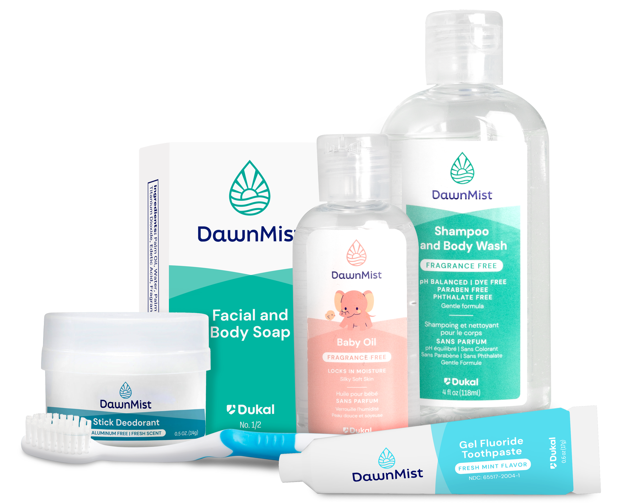
The name DawnMist™ evokes a story: the calm, dewy mist at daybreak. Historically, this story was told through varied symbols—an egret, ocean waves, and a rising sun. Dukal’s design team set out to unify these elements into a single, cohesive identity.
The result is a new visual mark that honors the brand’s legacy while building stronger equity for the future. The new icon combines a droplet, representing hydration, cleansing, and care, with a horizon line, symbolizing softness, renewal, and the start of a new day.
The result is a refreshed DawnMist™ logo that is clean, fluid, and comforting—featuring elements of movement, waves, ripples, and gentle mist.

Building a Unified Visual Language
The updated visual system employs a carefully considered color strategy centered on soft, muted tones that enhance the brand’s emotional resonance. A refined color-coding structure enhances product categorization, enabling clinicians and caregivers to quickly identify the right solutions with clarity and confidence.
Typography was modernized to support this clarity—clean, legible, and structured to perform well in both clinical and consumer-facing environments.
Envisioning the Future
The future of DawnMist™ is rooted in compassion. With its renewed identity, the brand is positioned to elevate its impact across healthcare settings by delivering care-focused products with a clear, consistent, and modern voice. The rebrand enhances the DawnMist™ story while establishing a cohesive design language across the whole portfolio—deepening trust, improving recognition, and supporting Dukal’s mission to deliver better health through every detail.